With numerous website creators (e.g. WordPress, Joomla, Doteasy Website Creator, etc.) available online, making a website should not be a difficult task for novice webmasters. You can create a website in just a few clicks. The auto script installer such as Softaculous simplifies the entire installation process.
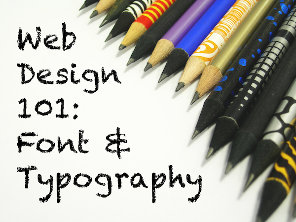
Everybody can now build a website without problems, but making your first website attractive is another story. First impressions of a website can affect subsequent judgments of credibility and usability of that particular website. Therefore, we will share numbers of useful tips on this Web Design Tips Series. The first two things we will talk about are Font and Typography. But before you begin designing your website, you should think about the overall tone and messages that you want to convey to your visitors: “Do you want a professional, sleek look, or a fun, vibrant website?”. Once you have made your decision, you can go ahead designing your website. But again, always keep in mind that you should stay consistent with the overall goal.
Readability
You should keep in mind the readability of your text, without sacrificing the look. Our recommendation is to use the font size of 12-14. Font size of 12-14 can offer readable text while making the text not too large to avoid the impression that you are yelling at your readers. If you are using font size 12 when typing out your report on Microsoft Word because of the readability issue, then you should use the same font size on a website.
Styles
Try different font styles to fine tune your website. But, please keep in mind that the key is to have a cohesive look throughout your website. Our suggestion is to choose 1-3 fonts and use them constantly throughout your website. You can also organize your website nicely by having one font for all titles and another font style for the content.
Before the actual launch of your website, please make sure you check the files in different browsers as texts may look differently on different browsers.
Colours
This is the rule of thumb: light text on dark background is a BAD idea. Studies have shown that people are “26% more accurate in reading text when they read it with dark characters on a light background.”
Another tip is to use sharp bright colours such as red for prominent items (e.g. the “Buy It Now” button with a white background). This can easily create a “call-for-action” effect.
We hope you find these tips helpful so please stay tuned for more web design tips. We will share more insights on colours, and other design elements.